Since 1999, Pantone has invariably selected the color that is set to define the incoming year. Covering a wide range of hues and tones throughout two and a half decades, this has become its own global tradition that many look forward to celebrating along with the holidays.
Now on their 27th announcement, however, this movement has seemingly taken a turn with the masses’ mixed reactions over the 2026 pick, Cloud Dancer, most of whom deem it unworthy to speak for an entire year. But is it really?
This style guide answers that question with an analysis of the color, what its selection tells us about where we’re headed on a cultural scale, and how you can use this to your advantage for your 2026 wardrobe rebrand.
Behind the Choice of Cloud Dancer
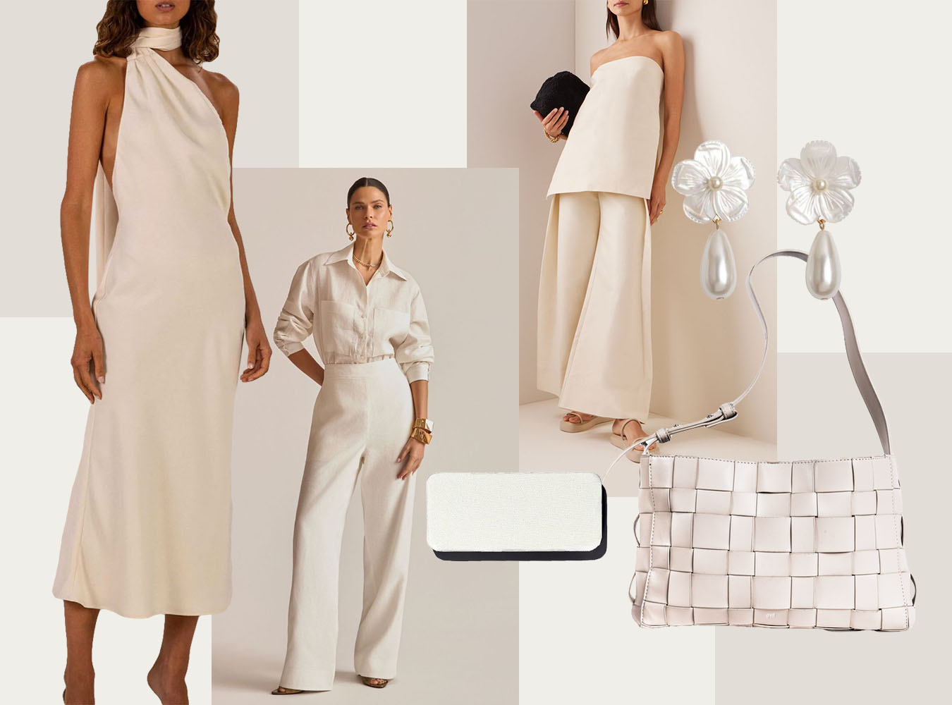
Almost immediately after Pantone unveiled Cloud Dancer as its 2026 Color of the Year, the internet was quick to express its many thoughts. Across articles and comment sections, critics either insisted that white hardly qualifies as a color at all, or went as far as to say the decision was rooted in political, racial interests.
Pantone addressed these concerns, clarifying through interviews and official statements that the choice came from their standard cultural forecasting process, which entailed reading shifts across design disciplines. Left with a “billowy, balanced white imbued with a feeling of serenity,” as described by Pantone Color Institute Executive Director Lea Eiseman, she insists Cloud Dancer is a response intended for overload: a color meant to calm in a frenetic society.
Building on this, the company then establishes the color as a blank canvas—an answer to collective calls for respite. “Less noise, less fuss, more simplicity,” Pantone Colour Institute Vice President Laurie Pressman says.
Your Cloud Dancer Style Notes
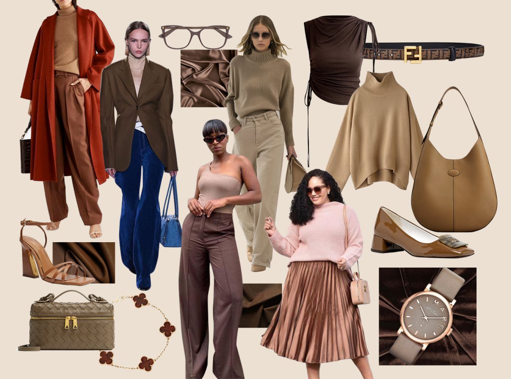
Pantone’s narrative also fits perfectly in the current state of fashion. Particularly directed to the rise of fast fashion and microtrends in the past five years, the selection of Cloud Dancer represents an invitation to seek clarity—to return to pieces and ensembles made and styled slowly, but intentionally.
Applying this to the way we dress, it all boils down to detail:
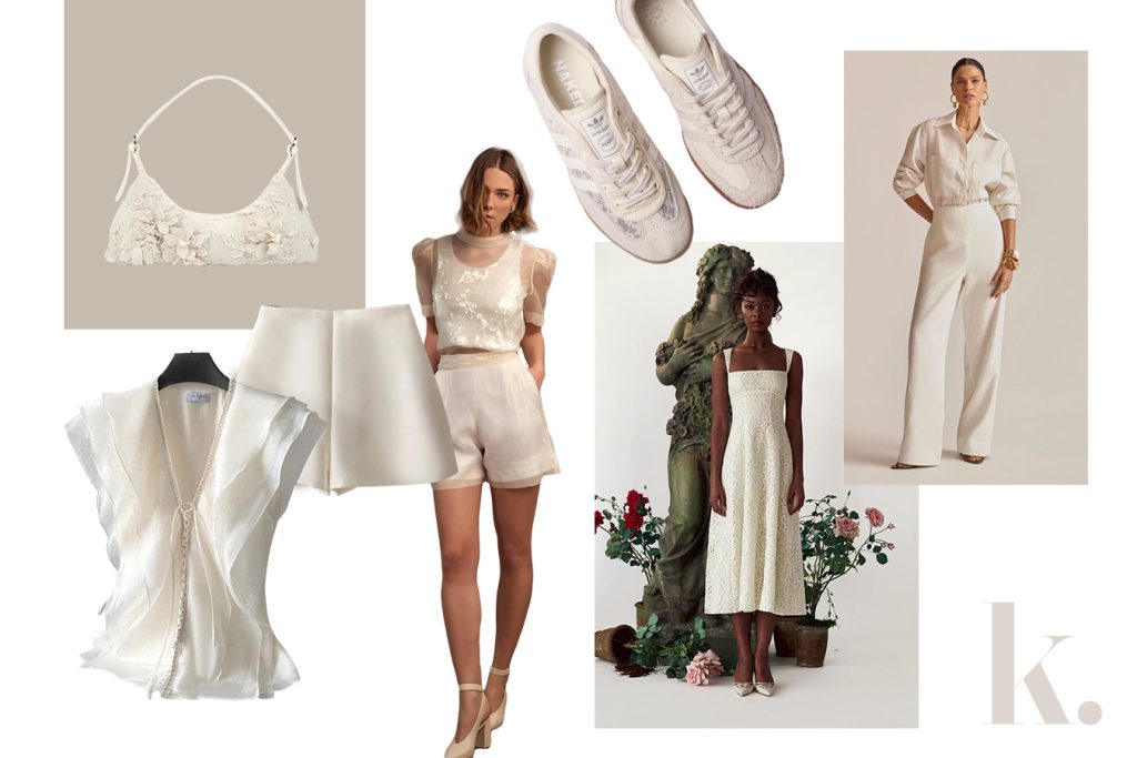
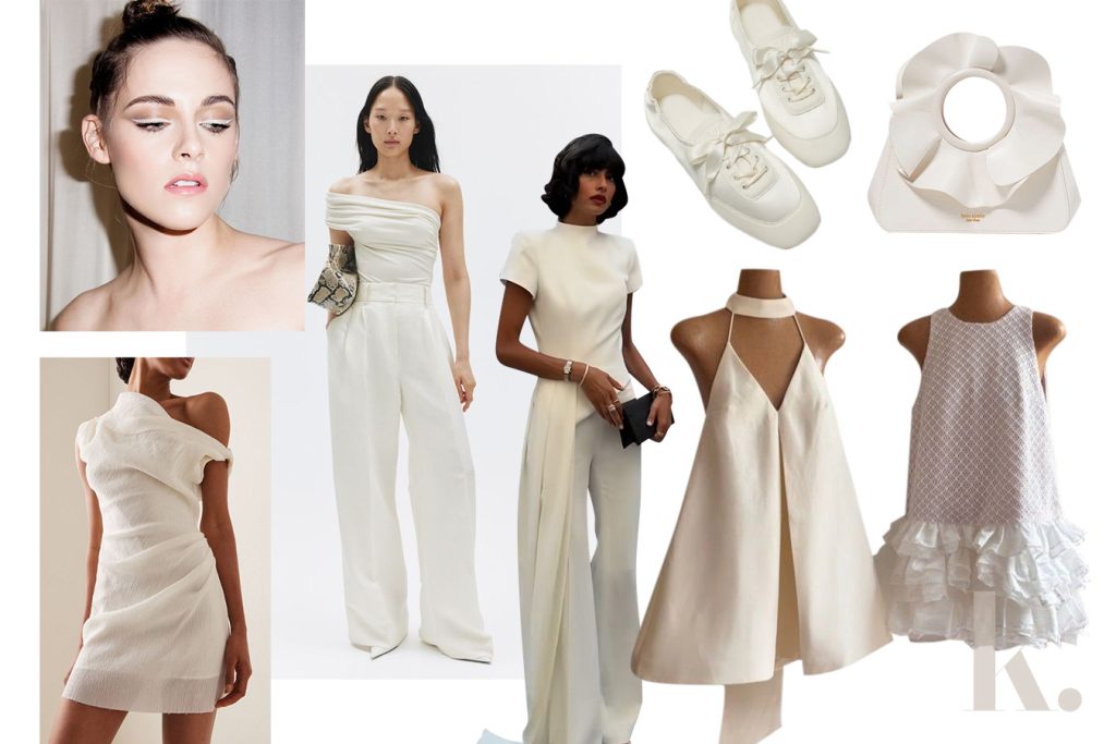
Texture
The quiet nature of Cloud Dancer brings texture to the forefront. Let the fabrics do the talking and mix your linens, knits, leathers, weaves, and silks for an effortlessly interesting look.
Structure
Because a neutral color doesn’t have to be basic. Explore pieces with distinctive necklines, jean cuts, skirt shapes, and sleeve styles, to keep the soft tones from feeling flat or unfinished. You can do this with structural designs like ruffles, pleats, and drapes as well.
Contrast
Adding a pop of color can help you avoid a dull getup. Neutral as it is, this is no different from Cloud Dancer. White details like cuffs and collars—along with accessories like bags, belts, and shoes—can break up darker tones and add more dimension to your outfit.
This is also applicable to makeup. A strong white eye look with white eyeshadow or white eyeliner can give a neutral look a bit more edge.
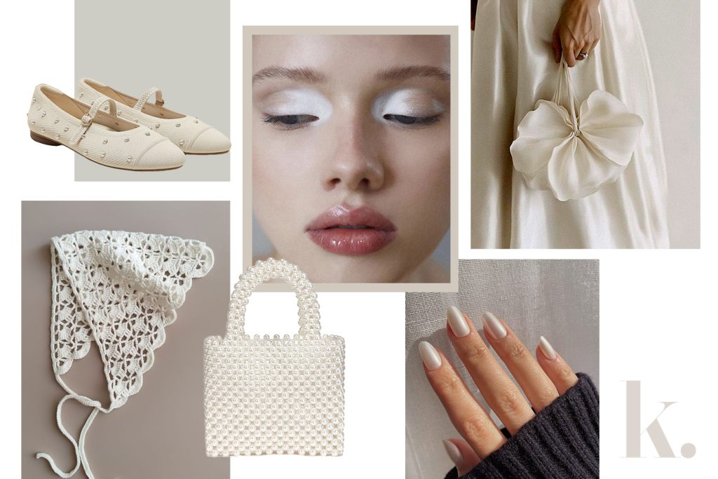
Embellishments
Think of them as finishing touches that will bring your vision to life. Delicate embroidery, intricate hand-beading, and subtle buttonwork and hardware are small details that can add just enough weight to ground such a light look.
The same goes for jewelry. Sticking to the theme, bits of pearl and opal stones act as accents that refine and complete the whole outfit.
Writer’s Picks
Now that we’ve gone through the ways Cloud Dancer can be worn, it’s time to put it into practice. Ahead, I’ve rounded up a few standout pieces in the color—all of which are easy to style and made to work beyond trend cycles.
Clothes
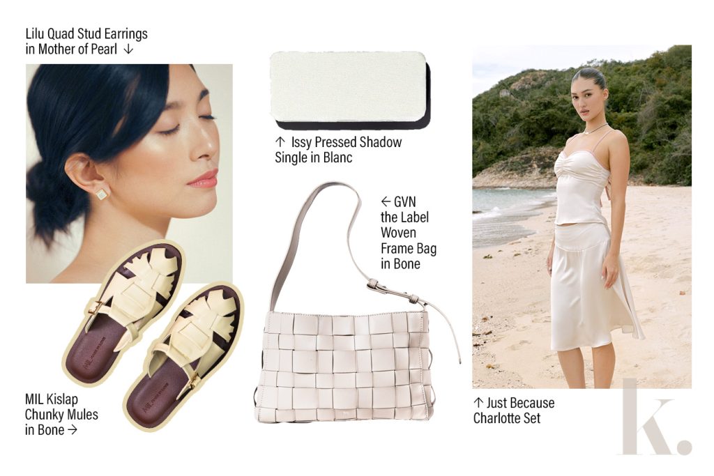
Shoes
Bags
Jewelry
- Lily Quad Stud Earrings in Mother of Pearl
- LJ Pearls Freshwater Pearl Necklace with Butterfly Pendant